Case Study
Helping Neurodiverse Professionals Thrive:
A Complete Product Redesign


Context:
Genius Finder is a SAAS product that helps neurodiverse professionals thrive at work while giving managers better ways to support their teams. Users are assessed on thirteen skill areas, receive personalised growth strategies, and can track their progress over time.
Company:
Genius Within LLC
Role:
Principal (Sole) Product Designer
Expertise:
UX Strategy, Research, Product Design, UX/UI, Illustration
Market:
B2B, SAAS, Healthcare

Interactive Figma Desktop Prototype Below
Challenge
How can we improve completion, engagement, and retention when users find HR training experiences boring?
Approach
Accessible &
Mobile First
Engagement & Retention
Seamless User Experience
Insight
Employees avoided the quiz not from laziness, but fear—of privacy breaches, workplace judgment, and career impact.
Recommendation
Improve trust through better messaging, HR support, and a more welcoming and usable design.
Roadmap
Business Goals
-
Increase engagement and completion of the Genius Finder Quiz.
-
Encourage users to return to the product regularly.
Product/Service Design Goals
-
Improve the interaction design, in line with WCAG 2.2 standards and UX best practices.
-
Responsive design (currently works on desktop only).
-
Improve the written tone of the product so that it is cohesive and friendly.
-
Remove unnecessary pop-ups, and provide contextual information on the screen.
-
Design an app for users who don’t sit at their desks all day, so they can have the strategies in their pockets.
Visual Design/Branding Goals
-
Create a consistent visual language, color palette, typography, iconography and hierarchy so that the product is cohesive, engaging and faster to design and develop.
Design Process: Product & UX Design
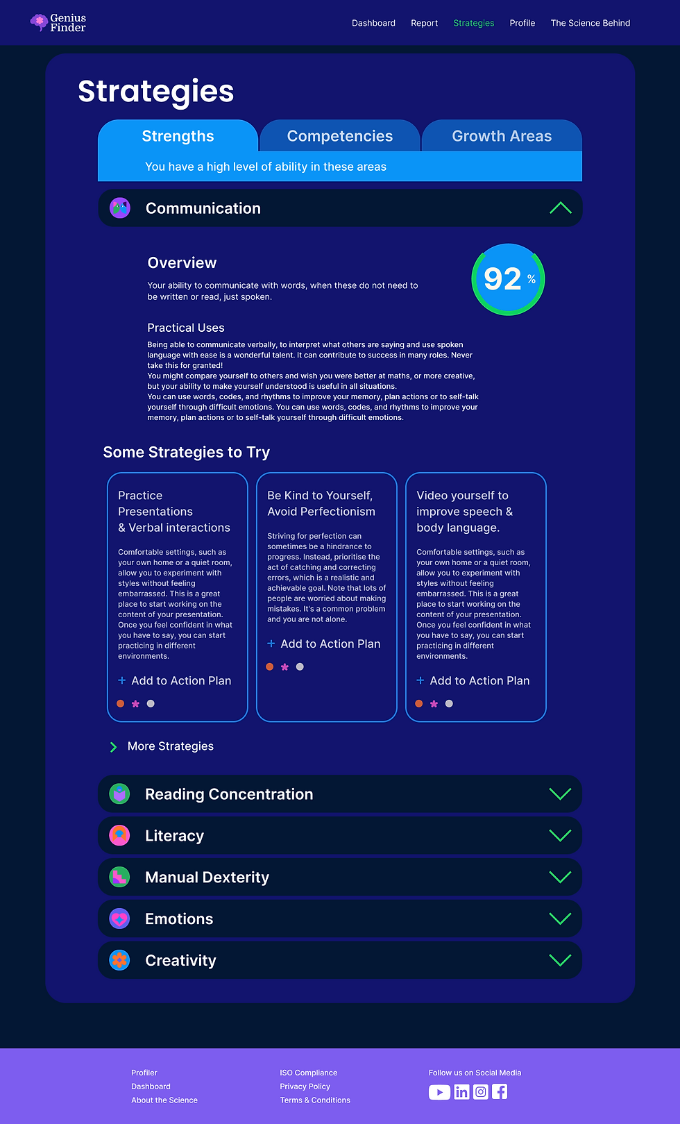
Improvements to the Psychometric Quiz
Onboarding that builds confidence: clear context, process preview, and an inviting CTA.
Eliminated the popups. Information now lives on-screen where users need it, reducing distraction and supporting neurodivergent users.


Interaction Design
Interactive candy engages the user.
Mouse over each icon below to see the hover state.
Visual Design Principles
Improve Engagement Through Consistent Design Language
The product's very personal subject matter required an approachable feel both to encourage engagement and differentiate it from the usual dull corporate HR training materials.
Colour Palette
Fresh, consistent palette, built around purple, the colour of neurodiversity, that feels more like a candy store than a plate of oatmeal.
FF6DD6
7D5DEF
FF732C
27EA60
09A4F7
12146F
Illustration for Storytelling
Clean hierarchy created through consistent text styles and sizes. Iconography and illustration built with simple building-block shapes make the product friendly and approachable.
Outcome
One month after launch we conducted user interviews to understand the improvements we were seeing with sales and through analytics.
25%
more users completed the psychometric quiz due to better messaging and engaging outreach.
14%
of users said that they were likely to return to the platform to interact with strategies.
Informally, the sales team felt that the new interface made the product easier to sell to companies and organisations..
Other things I would have liked to have done:
Improve Strategies
-
Understand if the way we present strategies is the most useful and engaging?
-
How useful were the strategies to users?
-
Does the categorization of strategies make sense, or would it be better to present them as time sensitive according to where the user is in their work day.urgent or for reflection - depending on the situation.
Interface Improvements
-
Dig into accessibility so that neurodivergent users can customise the interface according to their specific needs.
-
Allow users to compare their scores from previous quizzes in an interactive graph.
Mobile App
Design an app so that users in the field can access the strategies in the field.
Mobile Designs


Desktop